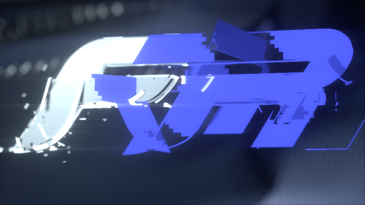
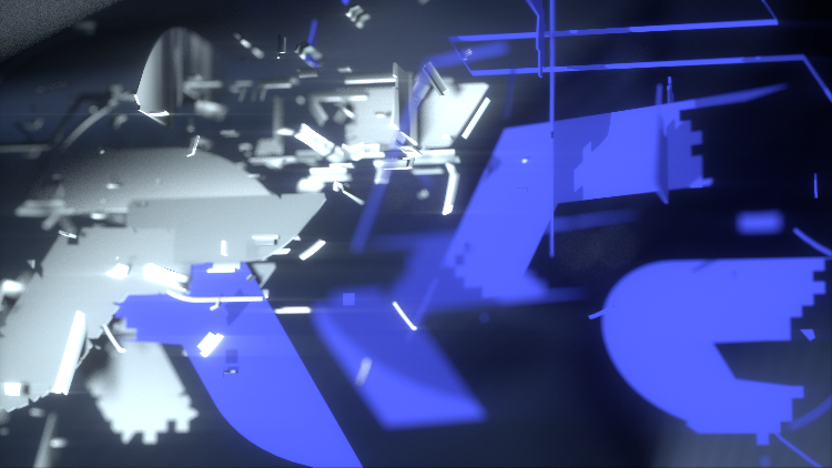
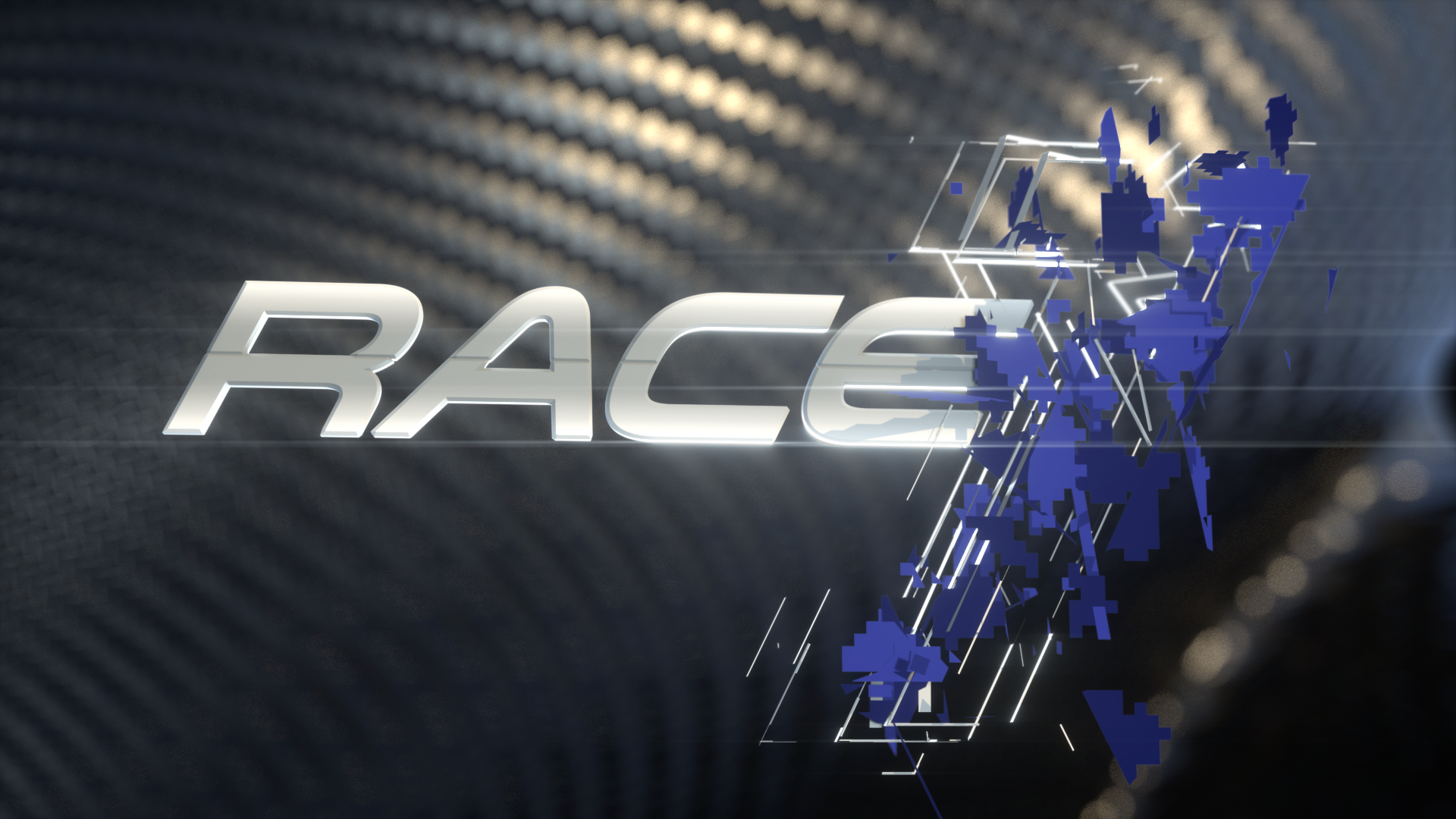
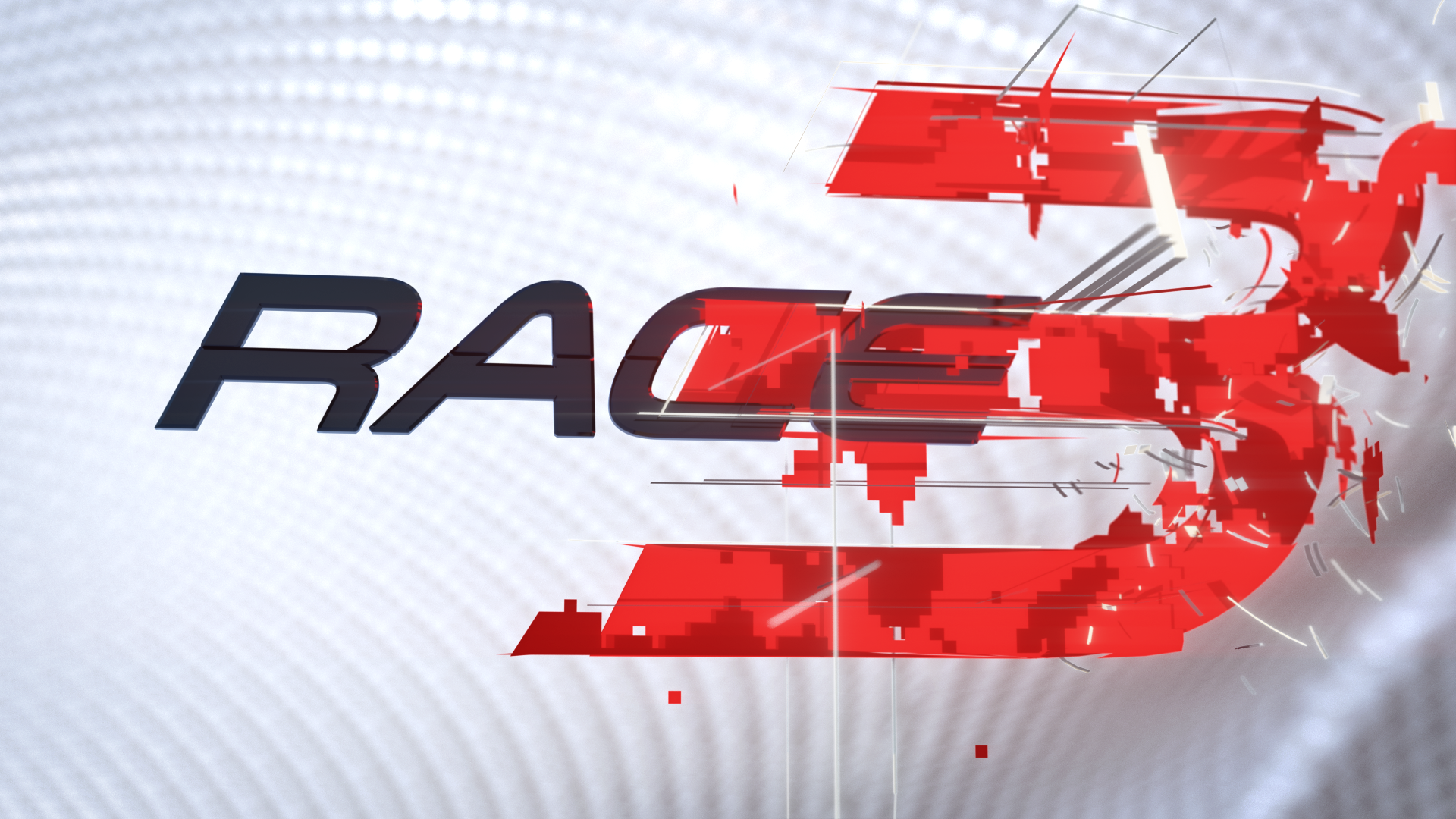
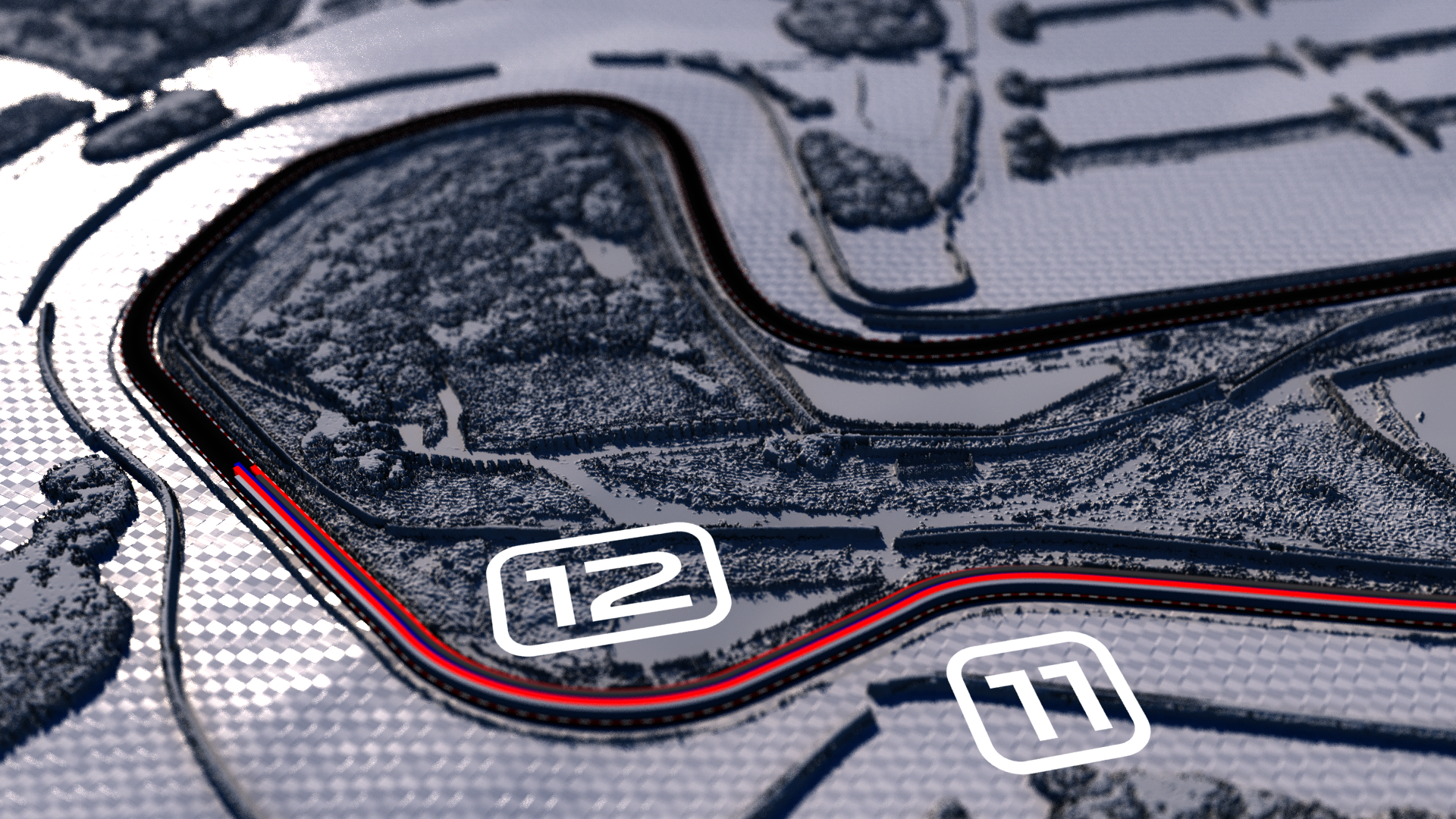
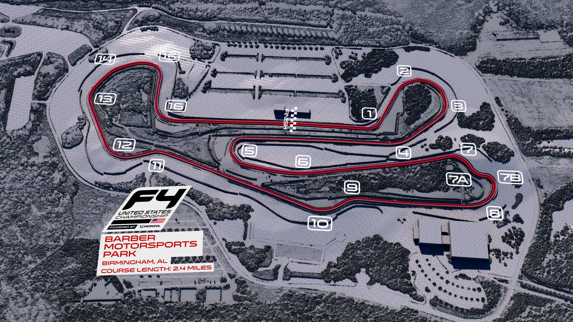
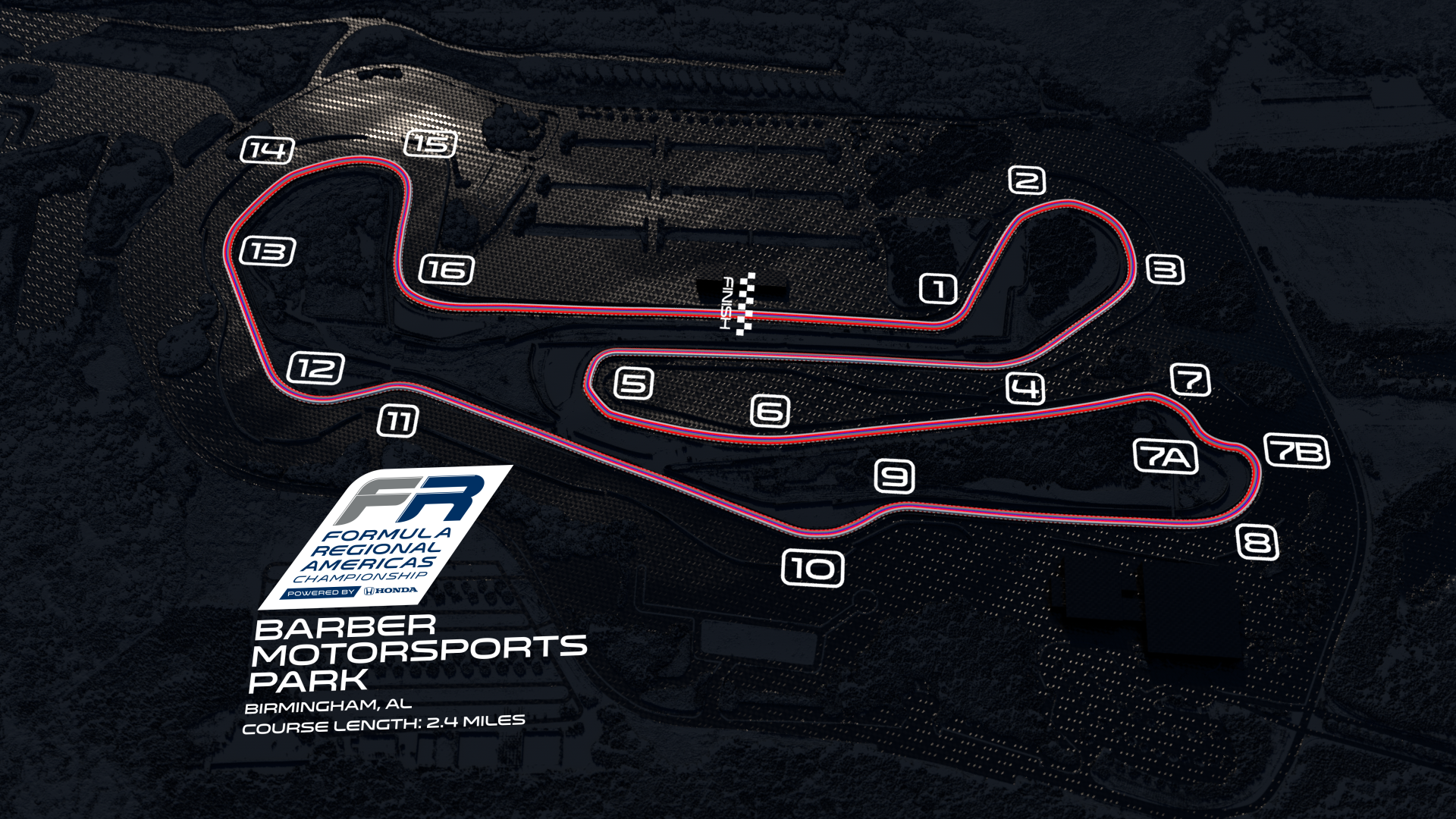
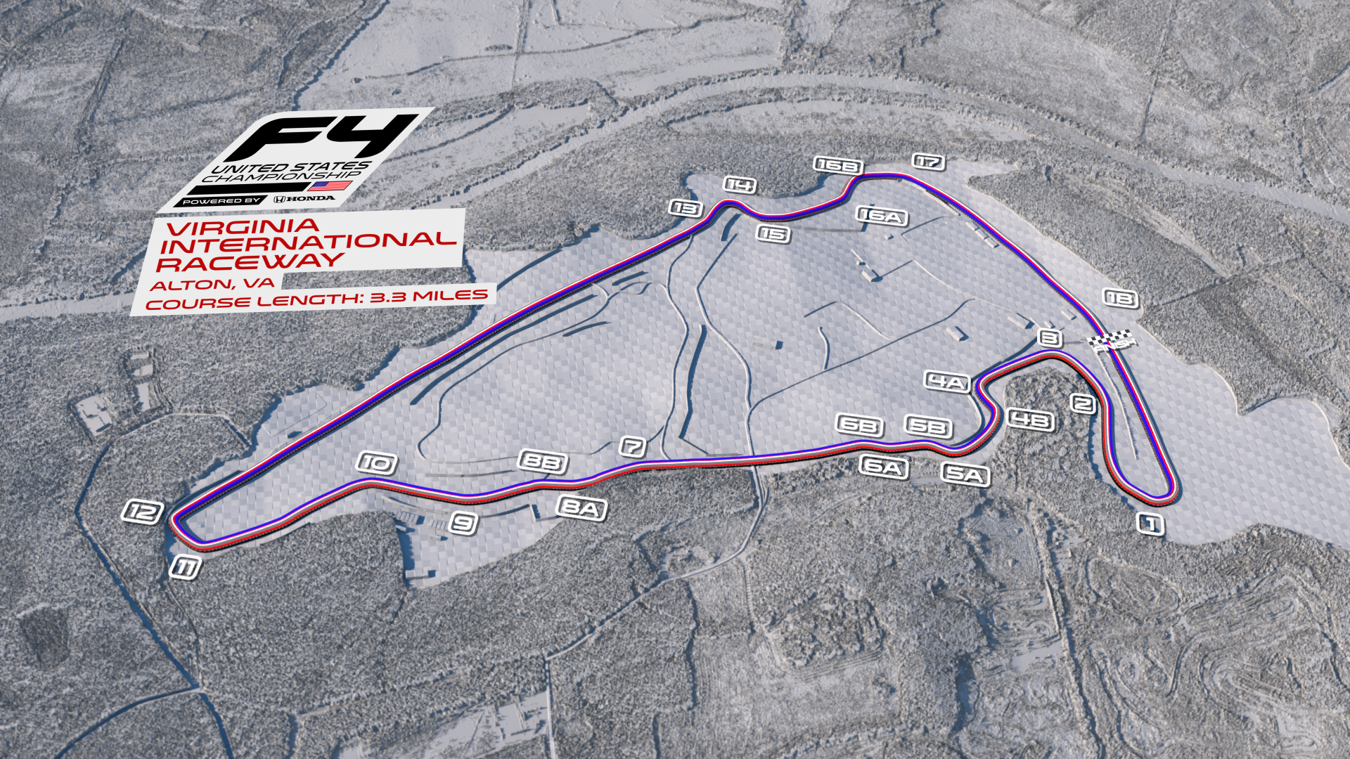
// Design, animation and production of course guides, bumpers, stings and incidental graphics requirements. With both championships frequently sharing race weekends, a shared basic graphic elements were used with divergence coming primarily in colour usage based upon the key colours used by each in their respective marketing collateral //
// This gave both a strong individual look while allowing for quicker turn around of race weekend-specific elements as they were used for on-the-day Social Media race edits as well as TV broadcasts //
Cinema 4D // Octane Render // Illustrator // After Effects
